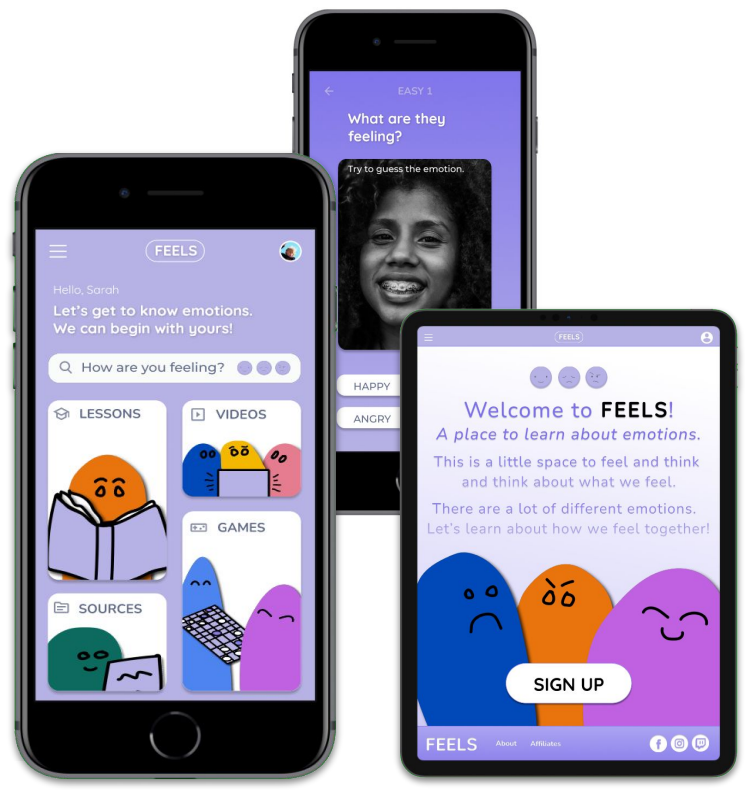
FEELS App and Responsive Website
FEELS is a socially focused project to help children name their emotions.
problem
Parents need an engaging tool to facilitate their children’s growth, learning processes, and maturation regarding emotional intelligence. Primary target users include busy working parents with children who need answers to complex questions concerning emotions.
challenge
The ability to balance work and family is something many parents want and need. Due to a lack of personal time, busy working parents need something to help their children learn about what they are feeling and get to know their emotions.
goal
Design a tool to help children learn about their emotions.
role
UX designer for the FEELS from conception to delivery.
user research & ideation

A group of working
adults and their children who were interested in finding a way to answer hard questions about
their emotions were interviewed.
The participants helped confirm that they do not have extra time to spare for special lessons on emotional awareness, they have also been unsuccessful in
locating the right tool to keep their children’s interest, and they could benefit from
a streamlined and entertaining educational app.

Problem statement: Jessica Watts is a busy parent who needs an easy way to help their kids learn about emotions because they are often too busy with their full time job.
Problem statement: Markus Green is a 6th grader and a growing child who needs a way to answer questions because their parents are often too busy with work.
initial design
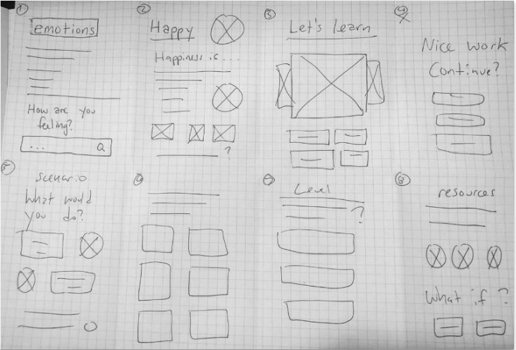
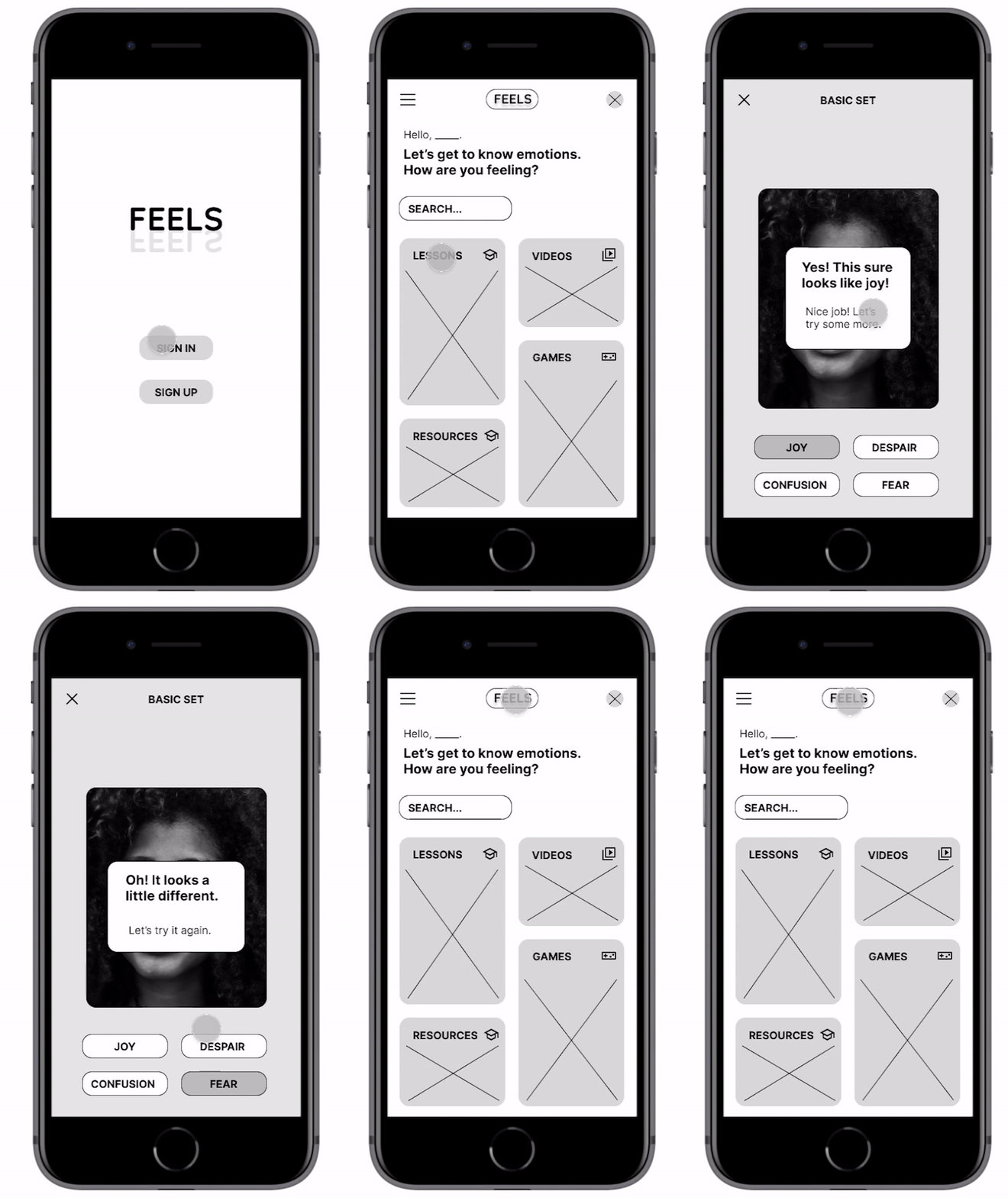
Coming out of the ideation process with crazy eights, the initial design had two navigational flows, one to search the app directly for information and another to house information pre-sorted into categories used, such as lessons and videos.
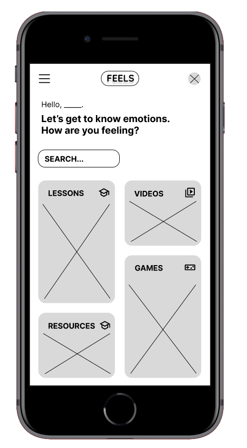
The top portion of the screen is a personal prompt for users to address their current feelings and find the information they need via search function.
The bottom portion of the screen situates different accessible cards, each linked to a unique group of essential features.
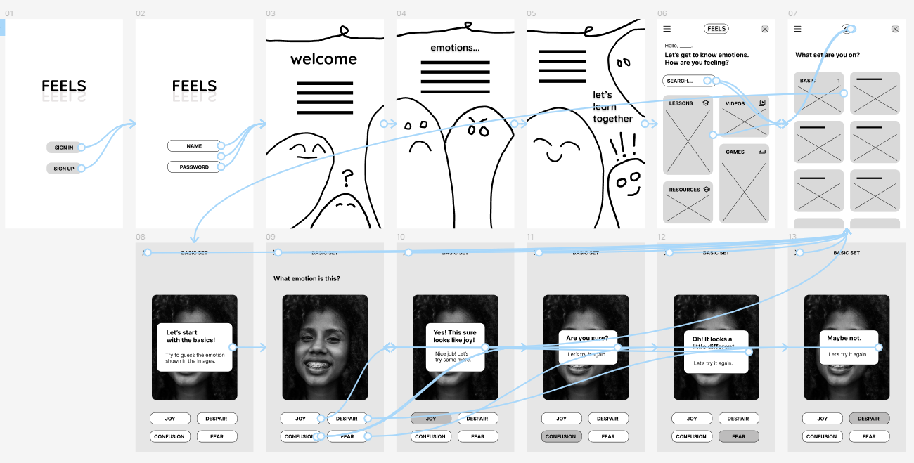
For
usability testing, the low-fidelity prototype connected digital wireframe
screens, including an introduction and a
trial lesson.
View the FEELS low-fidelity prototype.
View the FEELS low-fidelity prototype.
usability testing
study type
unmoderated usability study
location
Japan and USA, remote
participants
6 participants
length
30-60 minutes
findings
1. emotional Intelligence
To help develop their emotional intelligence, busy parents and their kids want an easy and inexpensive tool that is as insightful as it is engaging.
To help develop their emotional intelligence, busy parents and their kids want an easy and inexpensive tool that is as insightful as it is engaging.
2. language
A few of the children had some difficulty understanding the mock lesson’s vocabulary.
A few of the children had some difficulty understanding the mock lesson’s vocabulary.
3. search bar
Parents liked the search function but wanted a clear prompt on how to use it properly for their kids.
Parents liked the search function but wanted a clear prompt on how to use it properly for their kids.
design redefined
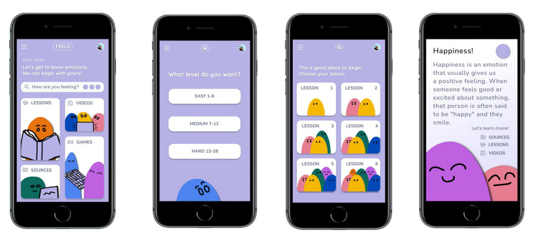
After many insights from
the study,
design changes were integreated to the
original wireframes, including adding the emotional
prompt “How are you
feeling?” into the search box
to help users navigate.
Other changes included removing the prompt box to uncover the test image, changing the “X” to an arrow icon to help navigation flow, and some of the language choices to give a more comprehensive age range of users a better understanding of the mockup.
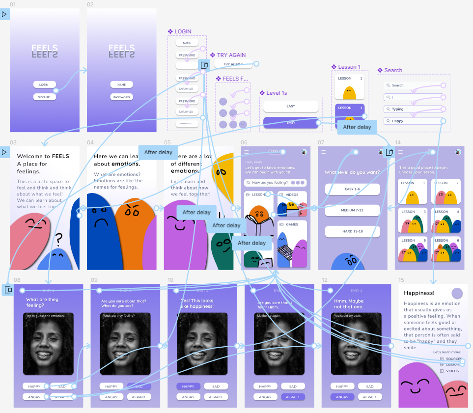
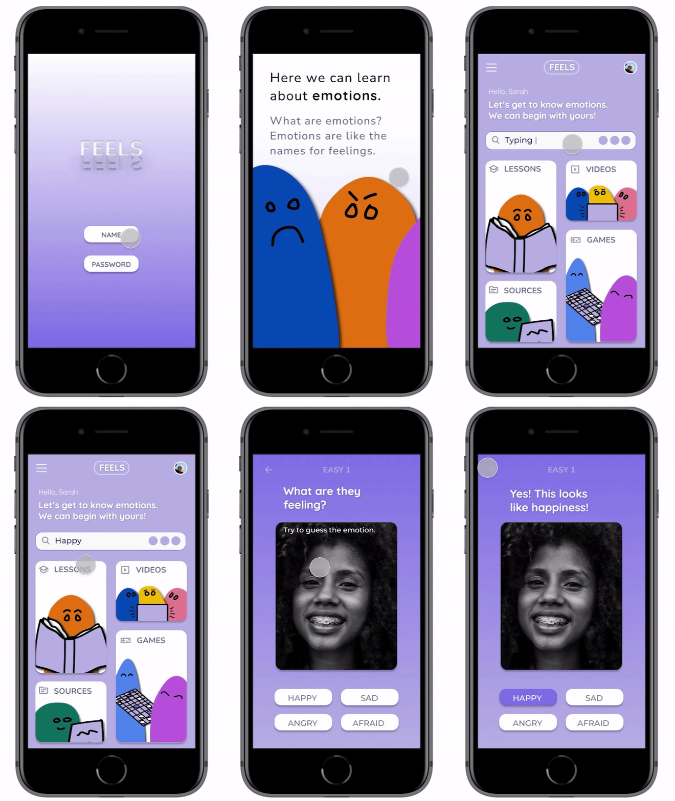
The high-fidelity prototype came with several extra pieces, including adding components for interaction flow, yet it still has the same user flow as the low-fidelity prototype.
View the FEELS high-fidelity prototype.
takeaways
impact
Parents and children enjoy the design, and the characters fascinate the kids. Both also appreciate the search function. They want to be able to search for information about what they are currently feeling.
user’s feedback
“What a cool concept! Once complete, I could see a lot of mental health professionals wanting to use the app with their child clients.”
lessons learned
While working on the FEELS app and responsive desktop site, I again saw the real-world benefits of user testing and usability studies, my ideas and simple sketches became real due to real user feedback.
next steps
1
Add more to the site to flesh out all the features.
2
Once complete, host another usability study to flesh out final aspects.
3
Integrate the illustrated characters into educational videos highlighting all of the different emotions.